Showing posts with label art direction. Show all posts

Friday, April 6, 2012

A Self Promotional Print Campaign for Digital Retouching By Dare for The Orange Apple.


Dare of Vancouver has created this visually compelling print campaign for - as one might guess - digitial retouching by Canada's The Orange Apple. Creatives take note... The Orange Apple was approached by Andrew Ablas and Rob Sweetman of Dare to create the three ads below (as opposed to the client soliciting the campaign) which show two dimensional drawings springing to life as three dimension worlds.

Click on the ads to enlarge and see them more clearly.

Mountains:


Sci-Fi:


Buildings:


Credits:
Advertising Agency: Dare, Vancouver, Canada
Creative Directors: Bryan Collins, Rob Sweetman
Art Directors: Andrew Alblas, Rachel Harrison
Copywriter: Darien Campbell
Photographer: Paul Lang
Retoucher: The Orange Apple
Published: April 2012


Courtesy of Ads of The World.

Friday, March 30, 2012

What The F Can You Design? Get In On The Flax Art Contest For Their Facebook Page.


If you're any sort of artist and have ever lived on the West Coast, chances are you are familiar with Flax Art and Design. The Flax family has enjoyed serving the creative community in the Bay Area through their legendary San Francisco retail store for over 72 years. Since 1938, they've become well known for carrying an incredible breadth of product, providing customers with a courteous and knowledgeable staff, and their ability to inspire creativity through the thoughtful presentation of merchandise.


above: San Francisco's oldest and most beloved art supply store at 1699 Market Street

Now, Flax is offering a contest to design the artwork for the masthead atop their Facebook page. Their original and legendary "F" logo, originally designed by respected graphic designer Lou Danziger, must be incorporated into the design and the winning designer will receive a $100 gift card as well as having their work featured on the Flax facebook timeline.

First off, a bit about the legendary Flax "F" which, if you did not know, is in the permanent design collection of the Museum of Modern Art.


above: the iconic "F" for Flax by legendary designer Lou Danziger, above right, is made up of 12 perfect squares

Harvey Flax, who ran the Los Angeles Flax store, commissioned a young designer named Louis Danzinger in 1949 to create a new trademark. The logo was originally intended to support Harvey’s private label program. The hot item at that time was a new formula of rubber cement that required just one coat (still called One-Coat today), and Harvey had drums of it in the back room for repackaging. Later the logo was adopted and shared with the other Flax businesses across the country, who also used it for the joint Flax catalog (see below).


above: 1968 Flax catalog No.9

Danzinger is one of the most respected graphic designers in America and currently teaches at his (and my own) alma mater, Art Center College of Design. He has created work for Microsoft, General Lighting, and A & M Records among others, and won many awards along the way. Danzinger’s goal was in “taking a minimal amount of material and a minimal amount of effort—nothing wasted—to achieve maximum impact.” Here he takes 12 perfect squares and creates a simple pattern with dramatic impact.


above: 12 perfect squares make up the F by Danziger for Flax

Featured in the book American Modernism: graphic design 1920-1960, the authors state “The ‘F’ is simply constructed, bold in weight and adaptable to many applications.”

The Flax Facebook Timeline art contest details and rules:

Enter Flax's Facebook cover photo contest for a chance to win a $100 gift card and see your artwork on the FLAX Facebook Timeline.

Who can enter: Artists of all levels are welcome to enter. Artwork must be original and all mediums will be considered.

What do you win? Winners will be chosen monthly and each will receive a $100 FLAX gift card. We will keep a permanent archive of winning art in our Facebook photo albums.

Deadline for Entries: April 30, 2012.

Design Requirements and Guidelines:
• Flax F Artwork must measure 851 x 315 pixels (8.85″ wide x 3.28″ high) and our original “F” logo must be incorporated in the design. The Flax “F” has a special history (which you know know if you've read this post) and you can see past examples of submitted entries to our catalog cover contest below.

• Submit digitally by email or mail us your original work and we will scan it. Important note: entries will not be returned! Finalists will be required to sign a letter confirming sole ownership of artwork. All published work becomes the property of FLAX art & design, with reuse of the work by the artist limited to self-promotion. Winners will be notified via email.

Background/Inspiration:
The artwork that graced the FLAX art & design catalogs for over 20 years (1984 – 2007) was creative and intriguing. Their call to artists enlisted work from art students, major advertising firms, freelance artists and casual art enthusiasts. In fact, their catalog cover contests were often prepared as a class assignment.

Take a peek at some of Flax's favorites over the years:


And when you visit their store, take a look at their Wall of Fame where the catalog covers hang proudly.


FLAX Art Store History:

above: 437 Kearny Street, the first FLAX location, 1938

Herman and Sylvia Flax, with their son Jerome, established Flax Artist's Materials in downtown San Francisco in 1938. Having lost virtually everything in the Great Depression, Herman took his family west from New Jersey and opened a tiny art supply store. Herman's three brothers also established independent, successful art supply outlets in New York, Los Angeles and Chicago, and eventually spread to Phoenix, Orlando and Atlanta. In 1952 Herman passed away at an early age, and upon returning from military service, Herman and Sylvia’s youngest son, Philip, joined the business alongside his brother Jerry. The Flax brothers grew close to their customers, becoming well known for their generous support of struggling artists and the local arts.


above: 255 Kearny at Bush, 1950

In 1975 Philip took full control of the company after Jerry left to pursue other interests. Then in 1981, after a more than 50-year presence downtown, the store moved to its current location on Market Street. With a small operation in the back of the store the company ventured into the mail order business in 1984. Within a year Flax moved its headquarters 10 miles south to Brisbane, providing the space needed to support the growing catalog business. In a continuation of the Flax culture of engaging the artist community, participants in an annual catalog cover competition created all the catalog covers. Over the years the Flax catalog was able to give over 100 artists national exposure to their talents.


above: 1699 Market Street, 2012

The store grew to 32,000 sq. ft. in 1997 after an expansion and remodel, which attracted a high number of new customers to the fresh look and expanded offerings. A makeover of the front exterior gave the store landmark status and a stop along the tourist route. With the new tag line “where creative people shop”, the transition was complete – Flax had become much more than an art store. The increase in size and variety has led to the Flax retail store becoming a “destination” for a unique shopping experience.


above: 1699 Market Street, 2012

FLAX has been voted by readers of SF Weekly as the "Best Art Supply Store in the Bay Area" every year since 2001.

Once again, submit your entries digitally or by email before April 30th, 2012. Winners will be notified by e-mail.


FLAX art & design
Cover Contest
1699 Market Street
San Francisco, Ca 94103

A special thanks to Howard Flax who writes the Flax Art Blog for additional images and information

Wednesday, February 1, 2012

Harper's Bazaar Undergoes Redesign & Launches With Double Gwyneth Paltrow Cover.


above: 2012 Harper's Bazaar March double cover design by Robin Derrick

After ten years, the US version of Harper's Bazaar has undergone a redesign to be unveiled on newsstands February 14th.

The new March cover is a double cover featuring Gwyneth Paltrow shot by photographer Terry Richardson. It was designed by Robin Derrick, who was the Creative Director for ten years of British Vogue until last June.

I wish they'd had to the courage to simply run the clean cover featuring the obscured Paltrow, but alas, they felt the need to include the more traditional looking one featuring content titles and the face of the blonde beauty- undoubtedly thinking that would sell more issues.

They've returned to their original elegant Didot font for the article titles on the cover and the feel of the stark cover is reminiscent of the timeless work of Harper's Bazaar legendary creative director, Alexey Brodovitch.


above: 1956 Harper's Bazaar July cover design by Alexey Brodovitch

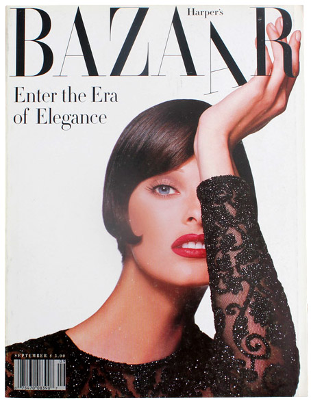
The new clean look of the front cover is also similar to my personal favorite cover of theirs from the past few decades designed by Fabien Baron for the September, 1992 issue featuring model Linda Evangelista shot by Patrick Demarchelier and shown below:


above: 1992 Harper's Bazaar September Cover design by Fabien Baron

Here's a look at the Gwyneth Paltrow editorial photos shot by Terry Richardson for the newly redesigned March issue:


above: Terry Richardson photos of Gwyneth Paltrow for the new March issue

WWD reports:
Glenda Bailey clutched the magazine close to her chest, like a Giants running back about to charge the Patriots’ defensive line. It was the first copy of the first redesign of Harper’s Bazaar in a decade, and she was understandably possessive of it.

“Let’s wait a minute,” said Bazaar’s editor in chief, taking a seat in an otherwise empty conference room on the 16th floor of Hearst Tower. “I just returned from the collections. How are you?”

The March issue finally lands on the table and it’s the cover that subscribers will receive. It shows a leggy blonde, wearing a skin-baring, long black dress from relatively new designer Anthony Vaccarello. Her long, wavy hair is covering her face. Is that a model?

“It’s Gwyneth Paltrow,” Bailey proclaimed. “It’s a very daring thing to do, where you don’t immediately see her face.” Bailey added, “As you know, I was the first to develop this two-cover approach.”

Here’s how the new Harper’s Bazaar can be summed up: it’s like the party guest who you recognize when she enters the room, but you know she’s had work done — a lot of work.

The magazine is larger by one inch, the paper quality is noticeably thicker and there is new cover typography. Inside the issue, the pages look less cluttered and thrown together, with more white space, while sections are more tightly edited. So far, there’s less celebrity and the related popcorn stories that can come with that. But in some ways, it still feels like the old Harper’s Bazaar. The black logo is the same. The emphasis is still on high fashion.


above: an example of an interior editorial from the newly redesigned Harper's Bazaar

“It’s going to take a while to get through it,” Bailey said with some pride, paging through all the advertisements in the front of the book. “It’s up 15.5 percent in ad pages, you know. We’re going to be here for a while.”

These are the results of new publisher Carol Smith, who has called March her first issue even though she joined last May. The turnaround in March ad pages is significant. The prior year, ad pages fell 12 percent, to 235. New advertisers include Tom Ford Fashion, Hervé Léger, David Webb, Alberta Ferretti, Alexis Bittar, RéVive, Nexxus and Lucky Brand.

But while the redesign gives Smith and Bailey a new tale to tell, Bazaar still has a lot of ground to make up — it remains the fourth fashion title in terms of ad pages, behind Vogue, InStyle and Elle.

Bailey landed on the first new section, “The List.” Almost every new section starts with the word “the.”

“This is the ultimate list of things to be aware of this month,” Bailey said. Paltrow has also produced a list of her own, “The A List.” Next up, the first of several “exclusives,” in the issue, beginning with a bracelet from Cartier that was originally designed by the brand in the Seventies. Editors at the magazine had been asking about it for years and it’s been reissued. “It really will be the must-have piece,” she said.

A few more tidbits from the issue: Derek Blasberg’s “Best-Dressed List,” an online feature, has become a monthly magazine column. Another story covers 24 hours with Tom Ford. He woke up at 4:30 a.m., took four baths and ate two doughnuts. The beauty section has been expanded, from four pages to 10 in every issue. Bailey has introduced a monthly travel section, “The Escape.” She plans to report on more news every month, to include the latest on art, film, books and trends. And she has kept the monthly feature “Fabulous at Every Age.” Bailey has even expanded upon it, in the beauty section.

Terry Richardson, a longtime contributor, photographed Paltrow for the cover. Karl Lagerfeld, Dan Jackson and Karim Sadli also shot features in the issue. Artist Liu Bolin painted designers including Alber Elbaz and Angela Missoni. “I just saw Alber and he told me there is still paint on his glasses,” Bailey added.

Mark Halperin and John Heilemann wrote a piece about Sarah Palin, pegged to the HBO movie of “Game Change,” based on their book. Lisa DePaulo has a piece about Stephanie Mack, the daughter-in-law of Bernie Madoff, while Vicky Ward wrote about Bernard-Henri Lévy.

When plans for the redesign were revealed in November, many observers were surprised to hear Robin Derrick, former creative director of British Vogue, was hired to consult. He ended up spending about a month on the project, not just working on the magazine but also on all of Bazaar’s social media. Later this year, the magazine will launch e-commerce — the latest move in the ongoing transformation of magazines from merely editorial and advertising vehicles to brands that literally sell the products they cover. “We’ve started to redesign online and we will see that continue,” Bailey added.

She said the new design approach can be summed in one sentence: “It is Didot Caps, Didot Italics and also an introduction of Gotham,” she said, talking typography and taking the magazine back into her hands.

A reporter asked if she could take the issue with her. Bailey replied: “I wish you could but I’m afraid you can’t. These are extremely rare. The team hasn’t even got a copy yet.”

With that, Bailey took hold of the issue and headed to the elevator. The fashion world will have to wait until it hits newsstands on Feb. 14 to see the new look.

images courtesy of Harper's Bazaar

Friday, October 21, 2011

Veer's Second Fun Font Film Is Out!


"Ready, Typeset, Go!" is the second in a series of retro science films about fonts, from Veer. In this installment, the narrator explains how simple adjustments like font size and technical tricks like kerning can make great fonts look even better.


Learn more about Veer and see the first font film here.

Sunday, August 21, 2011

Greeking For Groovy Art Directors. Hipster Ipsum - Artisanal Filler Text.


Lorem ipsum dolor got you down? No more, now there's Hipster Ispum, a text generator that infuses trendy words into your placeholder text. They offer two styles, Hipster with a shot of Latin and Hipster, neat.


An example of Hipster with a shot of Latin:

Homo mlkshk banh mi brunch biodiesel. Lo-fi echo park terry richardson 3 wolf moon, scenester gluten-free fanny pack. Brooklyn master cleanse locavore tattooed terry richardson freegan, homo gluten-free. Mixtape fanny pack banh mi put a bird on it. Quinoa vinyl thundercats wolf 8-bit you probably haven't heard of them. Helvetica lo-fi salvia 8-bit mustache hoodie 3 wolf moon iphone, lomo banh mi. High life mcsweeney's food truck ethical, jean shorts craft beer portland stumptown synth aesthetic retro artisan lo-fi VHS.


an example of Hipster Neat:

Fap mixtape trust fund retro. 8-bit cliche thundercats artisan PBR. Portland raw denim thundercats keytar helvetica dreamcatcher. Wolf photo booth thundercats tofu echo park, 8-bit mlkshk VHS master cleanse bicycle rights. Synth keytar craft beer, VHS marfa fixie american apparel gluten-free mustache. Cosby sweater skateboard before they sold out homo food truck. Quinoa mcsweeney's organic tumblr, letterpress dreamcatcher PBR.


Like other greeking generators, you can choose the number of paragraphs, choose between the two styles and voila.... filler for your layouts with a hint of hip.


Try it yourself.


A special shout out to one of my favorite artists, Danny Heller, who brought this gem of a find to my attention.